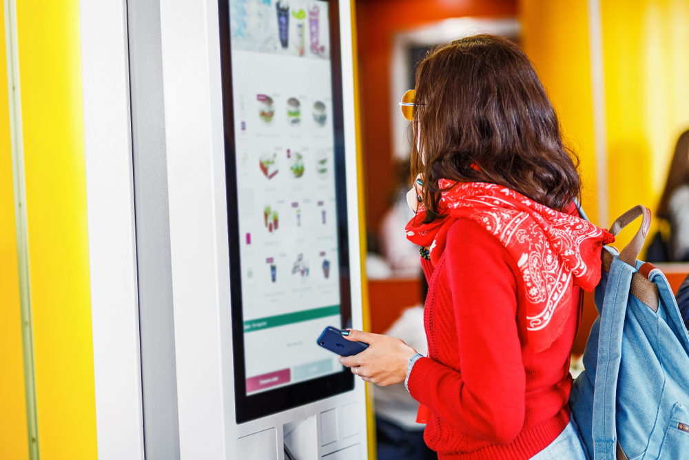
By 2019, it’s forecasted that smartphone users will number over two billion! Smartphones train people in the use of digital menus. If you’re going to compete in the marketplace, you need digital menu boards.
Digital boards work in many environments, including restaurants, spas, and medical offices. It’s crucial that your menu board design is well structured and easy to follow.
Read on for 7 eye-catching menu board design tips from the pros!
Maintain Balance
Your goal is for your customers to read the whole menu of available options. If one side of your menu has all the visual interest, customers won’t bother with the rest of the menu.
Balance out images and text so your customer scans the entire menu.
Saturation and Contrast
Heavy, saturated background colors against colored text make for difficult reading. Reading the menu options should be easy. Use nicely contrasting colors for background and text.
Judicious Use of Images
Use images of your real product so customers don’t complain about your product not living up to the image. Don’t overuse images. A few well-placed images entice your customer while maintaining good visual balance.
Avoid flashy animations and other distractions on your menu boards. Your customer is making a buying decision. They need accurate, easy-to-find information.
It’s All About Branding
Marketing is about branding. Make sure your brand is recognizable from your menu. Use your brand colors and theme. Your logo should be visible on all menu screens. Use your website for reference.
Your digital menu should reflect your website. It should feel familiar to your website users.
Structure with Categories, Columns, and Rows
Categories are non-negotiable. Your customers have an easy time ordering when items are sorted into categories. If they’re looking for dessert, they can find what they’re looking for in the “dessert” category.
If you’re selling food, use columns and rows for items, calorie information, and pricing.
Watch Your Text
Make sure category headings are in the largest text, making them easy to find on your digital menu board. Subcategories are the second largest text size. Calories and prices are third largest.
Use bold text for category headings.
Never use a font size that’s smaller than 26-40 pixels (20-30 pt). Your customers are likely looking at menu boards from some feet away. Text size needs to be large enough for them to read.
Use Empty Space
Give your text room to breathe. Don’t overload too much text onto one menu board. This is important but often forgotten in menu board design. Your customers will read your digital menu easily if the text isn’t overcrowded.
Menu Board Design
Digital menu boards are the wave of the future. Smartphone users expect them and know how to use them.
Smart menu board design is an important element for increasing sales for many businesses. Maintain balance, avoid high contrast and saturation, and don’t overuse images.
Follow your brand theme and colors, and don’t forget to include your logo. Make your text large enough. Use categories, columns, and rows. And don’t forget to use empty space!
Are you ready to get started with your own digital menu board? Contact us here.


