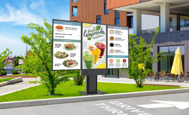
Because most customers spend an average of 109 seconds scanning a menu
While you may know the basics of what a coffee shop or beverage menu looks like, there are many things that go into creating good designs, but not for the purpose of “design”. There’s science behind the styling of a menu.
A place to begin, discussing the key ingredients for designing a successful menu for any business. And yes, you will want digital menus for this!
The science behind what customers see when they look at a menu.
The brain is a pattern-recognition machine. It’s hardwired to see patterns in everything, even if those patterns have no basis in reality. The human brain has an amazing ability to create new patterns while replacing old ones–and coffee shop digital menus are no exception!
When we look at a menu, our brains are automatically processing it for what it can tell us about what’s available at any given location. Whether at the movies, coffee shop or hair salon – a menu is a visual interface that lets the human brain make immediate decisions based on data. Heat maps are science- used for a wide range of applications from real-estate to our buying habits – inclusive of design and market research.
Heat Maps as it relates to retail.
Next level technology- Heat maps are a visual representation of data that uses color to show how often certain things happen in a particular location. They are used by businesses to analyze customer behavior and make improvements to their offerings, a big part of why you have to have digital menus. The data gathered in this technology can also be used for determining the effectiveness of your current menu design and the different ways to organize items- which may help guide future design decisions. You can perform manual work around by tracking ROI using qr codes and special offers.
Menu Design.
Because most customers spend an average of 109 seconds scanning a menu, there needs to be thought and effort into menu design. One menu design option is to use heat map technology to evaluate customers’ visual sequence and the likely path the human eye will follow when viewing a menu board. Take a listen for more details.
Branding and Design elements are a key way to sequence and visualize data. Effectively visualizing large amounts of data, such as how many people came in and out of a store during the day, or which products sold best after a promotion campaign is where things shift.
Technology and analytics is mirrored after human behavior. We’ve been experiencing this forever. Have you ever noticed how flattered a customer gets when they are remembered and asked, “do you want the usual” or your name is recalled when you walk in the door?
Building customer loyalty with your brand is as important as any other factor (month over month, year over year).
Some coffee shops just list their basic 5 coffees …and leave it at that
… as coffee enthusiasts, we think that’s not enough. A savvy owner wants to show you what else you can do with this wonderful starter beverage: minimum 3 dairy options, countless flavored syrups, different sweeteners, dusting of cinnamon or chocolate on top. Whew! Case in point the options are extensive, it can be difficult for customers to figure out what they want or what they want to try that is “new” to them. The solution is to use science and technology to help your customers make their decision by using digital menus to keep things fresh and visually appealing.
Multi-location coffee franchises need a little more than the basics to be in compliance and remain competitive. Along with basic components, there will be signature drinks from your favorite Barista.
A gentleman recently boasted to me when I tried to direct him to the other drive-thru that had no line “my favorite barista is on this side and I like the way she makes my drink”.
Visuals of products that are clear, colorful and even artistic sell. No wonder there are barista competitions yearly; these folks have some skills to make the perfect shot and create visual appeal, along with the perfect aroma from the roast – we are covering 3 of the 5 senses which makes the average cost of $3 – $5 a cup a little more palatable. Top that off with the 6th sense, customer service experience and you knock it out of the park.
A good menu makes it easy for customers to spot the items they want and order quickly.
…A great menu has them order something they never considered because they noticed it this time!
Design can highlight particular sections, making them stand out from the rest of the text and look more attractive visually. Digital Menus may cause you to add new fonts to your brand guidelines to satisfy the legibility on the monitor. Use your full branding guide. Consider – font usage (caps/lower case/bold), colors, multiple images and placement event background movement. Menu design is more than just making it look nice, it also has to be functional.
When designing a menu, it’s important to consider how customers will interact with it. If a customer wants a drink but can’t find it on the menu because it’s buried in text, they might leave without buying or worse, default to the same old thing and eventually lose interest. Consider how you treat your non-primary items like baked goods and food items at a coffee shop. If you don’t give them respect on the menu, people will dismiss them as after thoughts and be turned off.
Analytics can track your conversion rates by date, location and section of the menu. The bottom line is, analytics are satisfying and sexy gauging success on repeatable processes’ not just throwing spaghetti at the wall or designing a really pretty menu that no one can read!
Conclusion.
Of course, the best practice is to be aware of the science behind selling from a menu and understand the value of a “customer focused” menu. Your menu is the 6th screen – an extension of everywhere else people encounter your brand from social media to your website and your app!
Technology has become such an intricate part of our lives now we have high expectations as consumers for things to be consistent, and technology makes this easier. The way you engage people will influence how customers see your business, and you want to make sure that they look at your menu as a resource for information- in a positive light and not disregard it.
A menu is about more than just “items” ; they tell your corporate story. Remember: A stagnate customer soon to be bored is soon to leave for the next new place.


