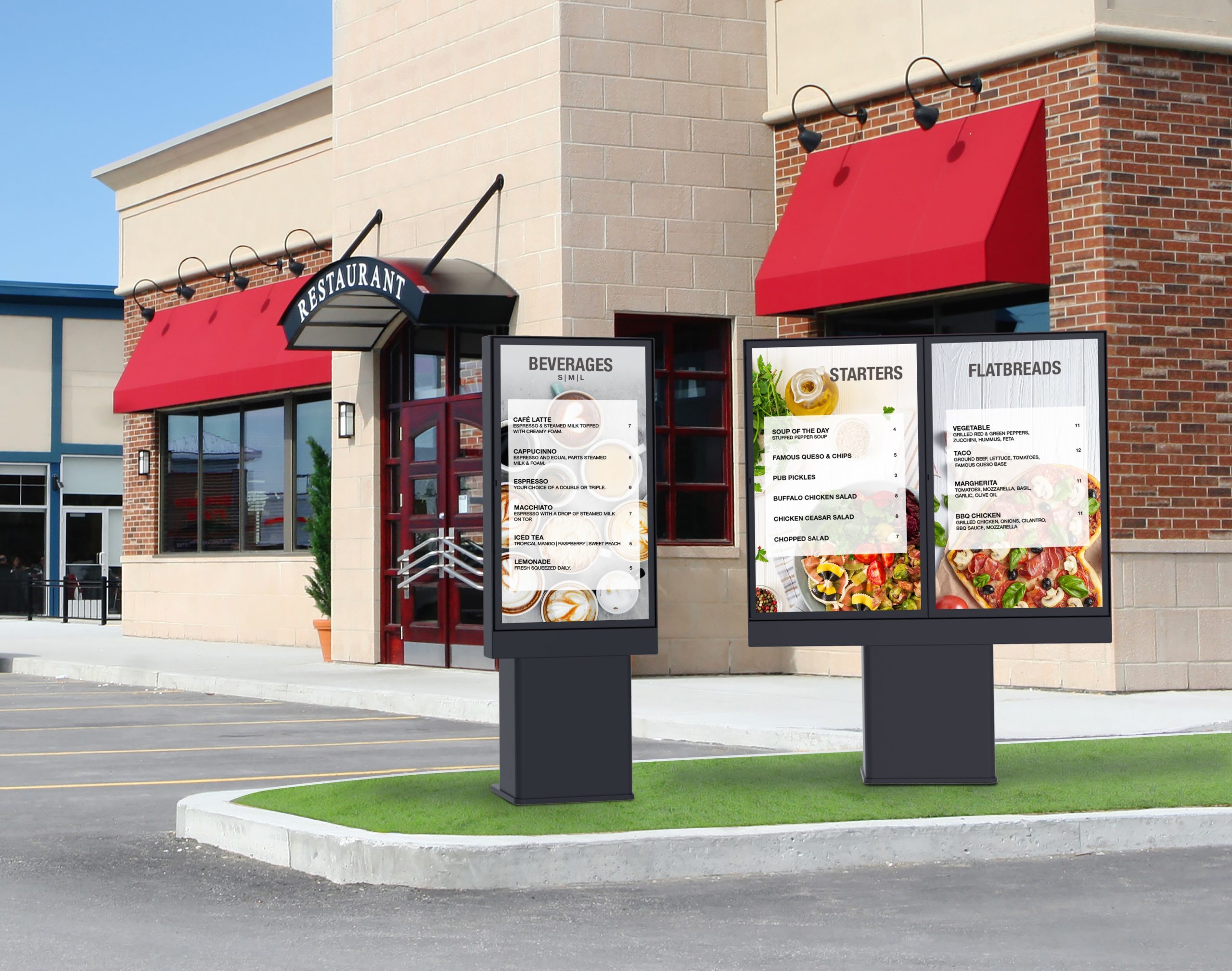
Rob Meiner, Peerless-AV – Fast Casual or Fast Food restaurants are known for many things: consistent, delicious food, quick service, and convenience. However, something that many people may not think of is the technology that goes into these restaurants, specifically the AV and digital signage aspects. Millions of dollars are spent each year on the design of point of sale materials and messages, such as menu boards, to drive improved sales. It is important to understand the “what and why” that drives consumer decisions and purchases, and anything that should be avoided in order to maximize the purchase. Let’s take a further look into the characteristics that make a QSR Menu Board successful.
How customers read and order from menus
Digital menu design is more of a freehand, pizza-cutter technique than a cookie-cutter one. It’s important to consider every detail about the customer, including how they read and order from menus. In a study completed by Cornell University, participants spent an average of 3 seconds looking at the first promotion menu board and read the menu sequentially like a book, moving from left to right and down the pages of the two-page menu. These details are imperative to keep in mind when determining where certain information should be displayed. For example, restaurants should position limited time offers in the upper, right-hand corner where they will receive the most visibility.
If a restaurant is looking to highlight a certain product, they should take full advantage of what digital signage can offer through the use of eye-catching animation and movement. Don’t treat a digital menu board like it’s static. Movement draws the eyes of the customer much more than a static display, especially because consumers are accustomed to online videos and digital content, so they crave that experience. Movement can also include subtle animations that promote add-on items—like adding bacon to a sandwich—all the way to doing an all-screen takeover where an animation fills the whole screen for a moment or two. It is proven that motion attracts more attention than static content, so it is important to leverage that where it makes sense, without making it overwhelming or too busy.
Digital Menu Content
While menus should use movement and animation to increase interest and sales, restaurants also need to design their digital menu clearly. Adding too much information and details can be confusing to customers and turn them away. Customers should be able to easily read the menu board, so it needs to be concise and legible, avoiding certain colors or types of font. Look to the in-store customer experience and determine where they are relative to the menus when they are considering what to order, or where up sell opportunities occur.
Most importantly, the effectiveness of digital menu technology comes down to the content displayed on the boards. The more effective the content, the better the results an operator will see from their digital menu board investment. At least one board should be dedicated to running bright, high-definition video or high-resolution pictures to catch the customer’s eye. Videos showing close-ups of one of your best-selling menu items are highly effective in whetting appetites and influencing purchasing behavior.
Following these steps will lead to a successful digital menu design resulting in an increase in sales. Be sure to keep an eye on customer characteristics and what is and is not working so the menu can be adjusted as needed. The menu can do more for business than just inform the customer. It can also be a visual tool to up sell guests and make them a returning customer.


